
How to Configure Footprint Color Schemes
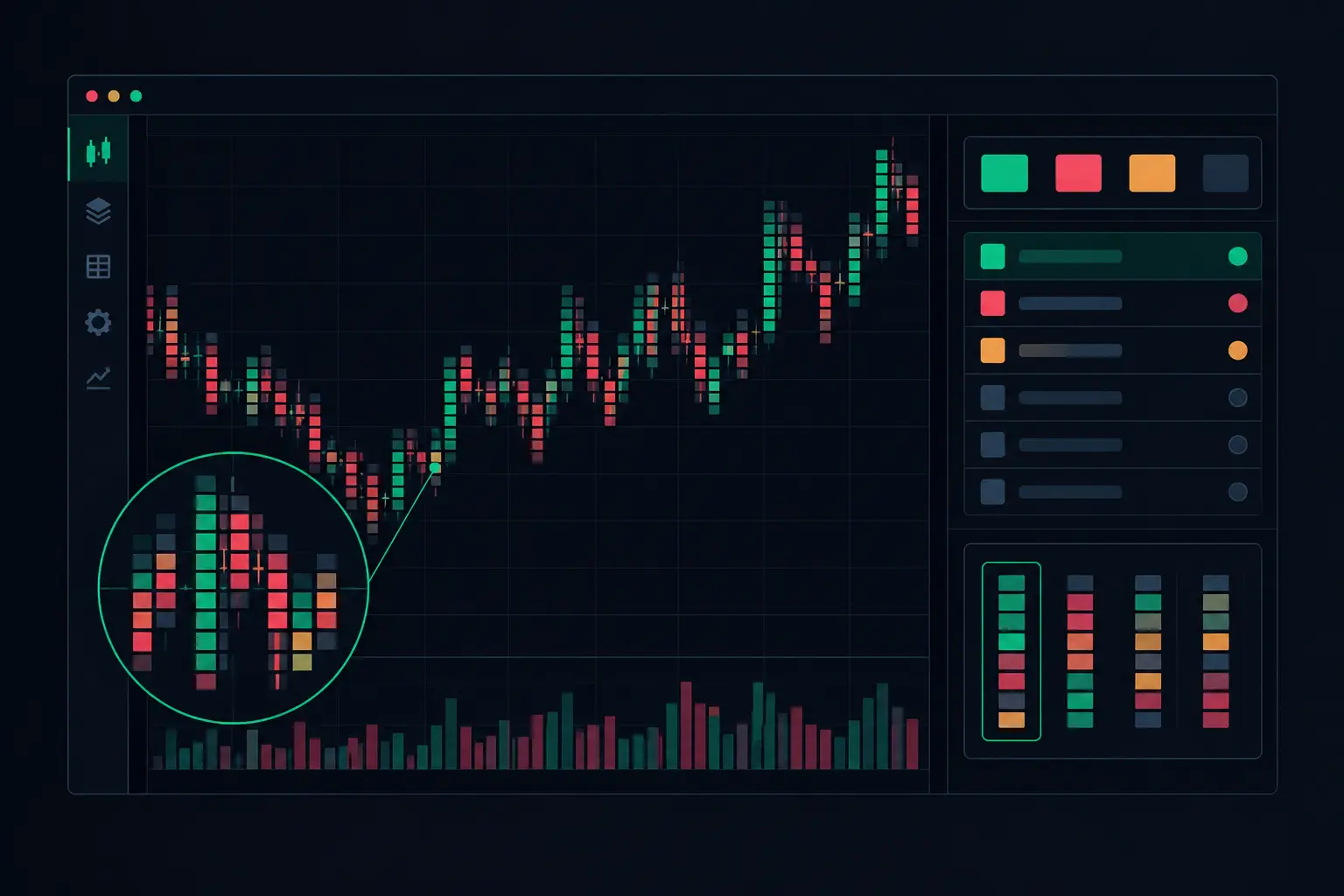
A fast ES auction can print dense bid and ask activity across dozens of price levels before a conventional candle provides any useful context. When you configure footprint color schemes with intent, the chart does not become more decorative. It becomes faster to parse: aggressive lifting, aggressive hitting, absorption, imbalance structure, and the developing VPOC each occupy a defined visual role.
The objective is not to color every condition. It is to create hierarchy. Your eyes should reach the most relevant auction information before they start reading individual volume numbers. SidiFootprint provides deep control over cell backgrounds, text, profile columns, imbalance states, delta conditions, VPOC, value areas, and developing bars. That range is useful only when the scheme is built around how you actually read order flow.
Configure Footprint Color Schemes Around Information Hierarchy
Start by deciding what deserves immediate attention at chart speed. For many footprint layouts, that is not raw volume alone. It is the relationship between aggressive volume, location, and response. A large ask print at the high of a developing bar has a different meaning from the same print in the center of a balanced rotation. Your colors should preserve that distinction rather than flatten it.
Build the chart in layers. The lowest-priority layer is the neutral footprint grid: ordinary bid and ask numbers that provide baseline auction detail. Above that sit meaningful volume or delta conditions. Above those sit structural events such as diagonal imbalances, stacked imbalances, absorption, exhaustion, and VPOC. The highest-priority elements should remain visible even when several conditions occur at the same price.
This is why a full spectrum often creates less clarity than a restrained palette. If every high-volume cell is bright, every imbalance is saturated, and every profile feature has its own competing color, the chart forces the eye to decode formatting instead of activity. Reserve the strongest contrast for conditions that demand a second look.
Establish a neutral base first
Use a subdued background for normal footprint cells and a text color that remains legible at small chart scale. Dark chart themes typically benefit from muted charcoal, deep blue-gray, or nearly black cell backgrounds with off-white numeric text. On light themes, use soft gray cells with dark text rather than pure white everywhere. Pure white and pure black create unnecessary glare during extended screen time.
The neutral state matters because it defines the reference point for every later condition. A cell with ordinary two-way trade should look ordinary. If the base layer already appears intense, a genuine volume extreme cannot stand apart.
Set bid and ask text to related but distinguishable tones when you want side-by-side reading at a glance. Keep the difference controlled. A cool-toned bid and a warm-toned ask can work well, but only if both remain secondary to active condition colors. If your method reads total volume first and bid/ask detail second, use one neutral text color and let the number placement do the separation.
Assign Color by Function, Not by Preference
A color scheme becomes operational when each color has one job. Before changing individual settings, define the function of your primary colors.
Green-family colors are commonly assigned to aggressive buying because they align naturally with ask-side execution. Red-family colors fit aggressive selling on the bid. That convention is useful, but the exact shades matter more than the convention. Avoid neon green and saturated red as default text colors. Save high-intensity shades for threshold events or stacked conditions.
Use a separate accent family for location-based structure. Gold, amber, or violet can isolate VPOC and profile references without implying directional pressure. This separation is critical. VPOC identifies the price with the greatest traded volume in the selected profile or bar. It is a volume-location reference, not an ask-side or bid-side event. Coloring it with your aggressive-buy or aggressive-sell colors creates false visual association.
For secondary context, use lower-saturation variants of the same palette. A moderate positive delta condition might use muted green text or a soft green cell fill, while an extreme positive delta condition uses bright text with a more visible background. The same progression can apply to negative delta. This creates a readable scale without introducing a new color for every threshold.
Separate cell fill from text color
Cell background and numeric text do different work. Backgrounds are effective for scanning regions and identifying clusters. Text colors are better for retaining detail inside dense bars. Applying strong background fills to every qualifying cell can obscure the ladder, especially during high-volume periods.
A practical division is to use text color for normal threshold conditions and cell fill for exceptional states. For example, a moderate volume condition can alter the number color, while a major volume extreme receives a shaded background. This lets the eye identify the larger event from distance, then read the actual bid, ask, delta, or total volume at the price.
Keep the contrast between text and fill high enough for the chart scale you use. A dark red number on a dark gray fill may look acceptable in a settings window and disappear on a live chart. Test colors at the smallest bar width and font size you use during active sessions.
Color Imbalances Without Hiding the Auction
Diagonal imbalances deserve their own visual treatment because their calculation is relational. An ask imbalance compares ask volume at one price with bid volume one tick below. A bid imbalance compares bid volume at one price with ask volume one tick above. The chart should make that one-sided aggression visible without turning every bar into a solid block of color.
Use distinct but related colors for ask and bid imbalances. A controlled green for ask-side imbalances and controlled red for bid-side imbalances preserves immediate directional orientation. Then reserve a stronger shade, border, or background treatment for stacked imbalances. A stack is structurally different from a single imbalance because several adjacent prices show aligned aggressive participation.
Do not let imbalance formatting overwrite VPOC or other priority markers without a plan. When an imbalance and VPOC occur at the same price, you need to decide which feature should own the background and which should use text, a border, or a profile-column highlight. In many layouts, VPOC can remain a thin line or dedicated profile color while the imbalance controls cell text. The correct choice depends on whether your read begins with profile location or with bid/ask aggression.
Keep Delta and Volume Conditions Distinct
Volume answers how much traded. Delta answers the difference between aggressive ask volume and aggressive bid volume. They often align, but they are not interchangeable. A color scheme that uses identical formatting for both removes a useful distinction.
Give total-volume thresholds a neutral intensity scale, such as gray through amber, rather than making them directional by default. Then assign positive and negative delta their own opposing colors. This makes it possible to identify a high-volume price with muted delta, or a strong delta print that occurred on relatively modest volume.
The same principle applies to bar-level and session-level cumulative delta displays. Use a color transition that communicates positive versus negative state, but avoid making the entire bar background change for small fluctuations. Small changes in cumulative delta are common. Strong formatting should be reserved for the thresholds that matter within your chosen instrument and bar construction.
Preserve absorption and exhaustion visibility
Absorption and exhaustion settings should not share the exact same colors as standard delta or volume extremes. These conditions describe interaction and response, not merely a large printed number. Give them a separate accent treatment, such as a border, marker color, or limited background shade.
For example, absorption can use a cool accent that remains visually separate from aggressive ask and bid colors. Exhaustion can use a lighter, high-contrast treatment that reads clearly near bar extremes. The point is to recognize the condition as a distinct auction event before reading its exact location and footprint values.
Use Profile Columns as a Separate Visual Channel
Dual independent profile columns are an opportunity to reduce clutter inside the footprint itself. One column can display total volume distribution while another shows delta distribution, session profile information, or a complementary metric. Their colors should support the footprint, not compete with it.
Use restrained fills in profile columns and reserve brighter colors for VPOC, value area boundaries, and developing references. If the footprint cells already use green and red for ask and bid activity, a neutral profile palette with an amber VPOC often creates cleaner separation. You can see where volume accumulated without confusing profile structure with immediate aggressor behavior.
Developing bars require special care. Their values and profile structure change as new trades arrive, so heavy color transitions can produce visual flicker. Use stable base colors for developing elements and apply threshold-based highlighting only where it improves recognition. The chart should remain readable while the tape is moving, not constantly demand attention because every update repaints the palette.
Validate the Scheme Under Real Chart Density
Do not judge a color layout from one quiet bar. Load a session containing rotations, directional auction, high-volume nodes, low-volume traversals, and periods of rapid execution. Compress the chart, expand it, and view it at the monitor brightness you actually use. A scheme that looks precise when five bars are visible can fail when 50 bars and two profile columns are on screen.
Check three things. First, can you identify VPOC and value-area references without reading every number? Second, can you distinguish a stacked imbalance from a single imbalance immediately? Third, do delta, volume, and absorption conditions remain visually separate when they overlap? If any answer is no, reduce saturation before adding more formatting.
Save layouts that serve distinct chart jobs rather than forcing one palette to cover every timeframe. A fast intraday footprint may need sharper threshold contrast and fewer profile colors. A broader session chart can support more profile detail and quieter cell formatting. SidiFootprint's configuration depth makes both possible, but the best scheme is the one that keeps the auction legible at the speed you need to read it.
A disciplined palette turns the footprint from a wall of numbers into ordered market structure. Make every color earn its place, and the chart will show what actually traded at each price without asking your eyes to sort through noise first.
See it on your own chart.
Every Sidi tool is unlocked in the free 14-day demo. Install SidiFootprint in NinjaTrader 8 and load one of the finished color styles to start.
Start free 14-day demo → SidiFootprint features Browse color stylesRelated articles

NinjaTrader 8 Footprint Chart for Faster Reads
Build a NinjaTrader 8 footprint chart that exposes delta, imbalances, absorption, VPOC, and auction context when futures order flow accelerates fast.
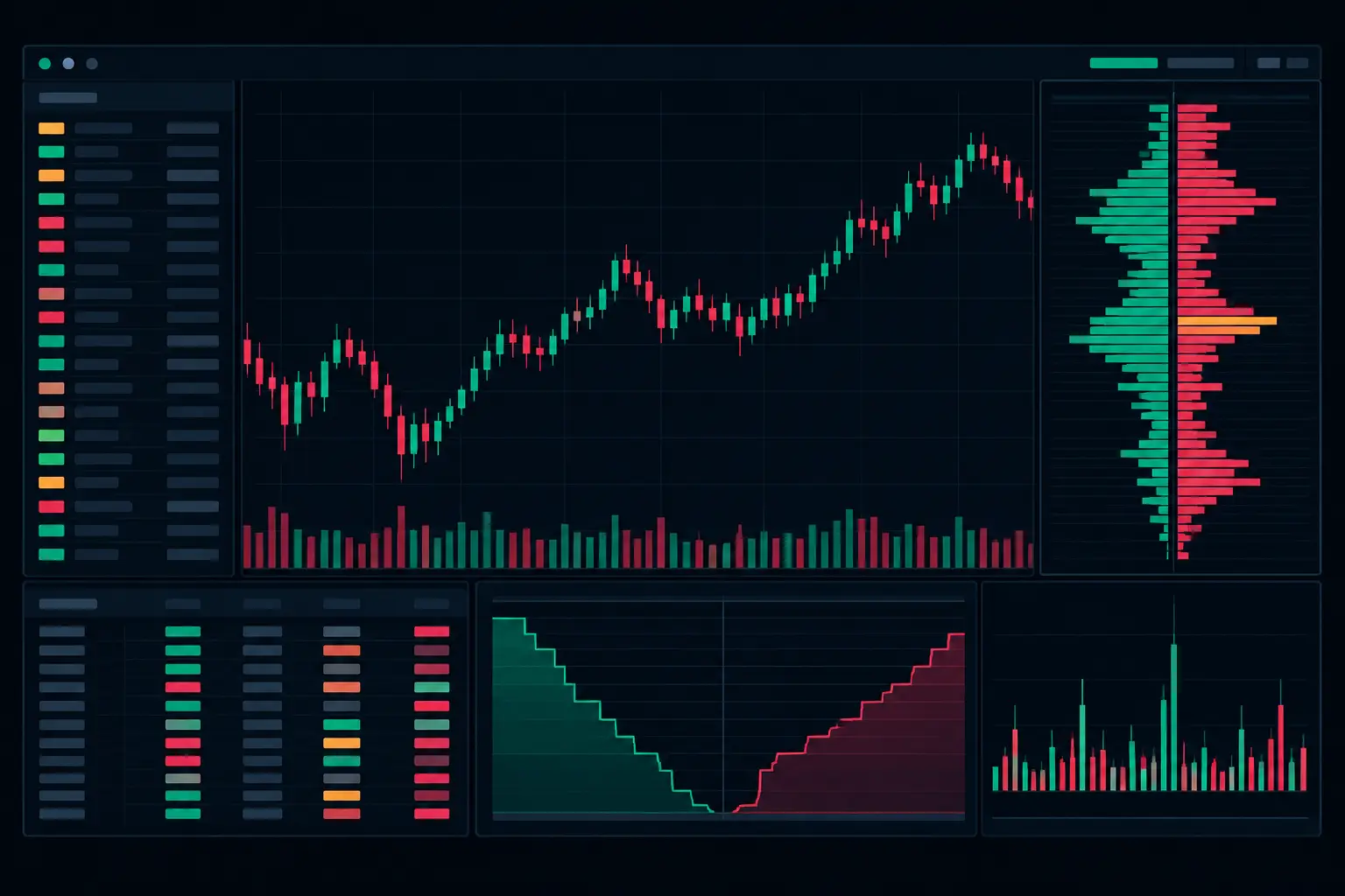
Futures Order Flow Visualization Guide for E-mini
Use this futures order flow visualization guide to configure footprint, delta, VPOC, profiles, and imbalance context for fast E-mini auctions each day.
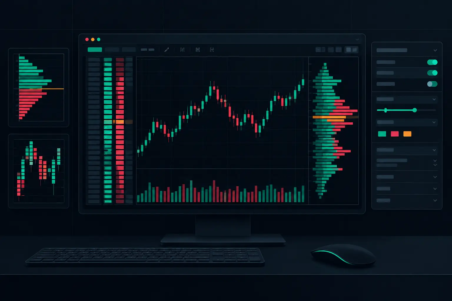
NinjaTrader 8 Order Flow Configuration Setup
Configure NinjaTrader 8 order flow configuration for precise footprint charts, profiles, imbalances, delta, and fast real-time market context on tape.