
Futures Order Flow Visualization Guide for E-mini
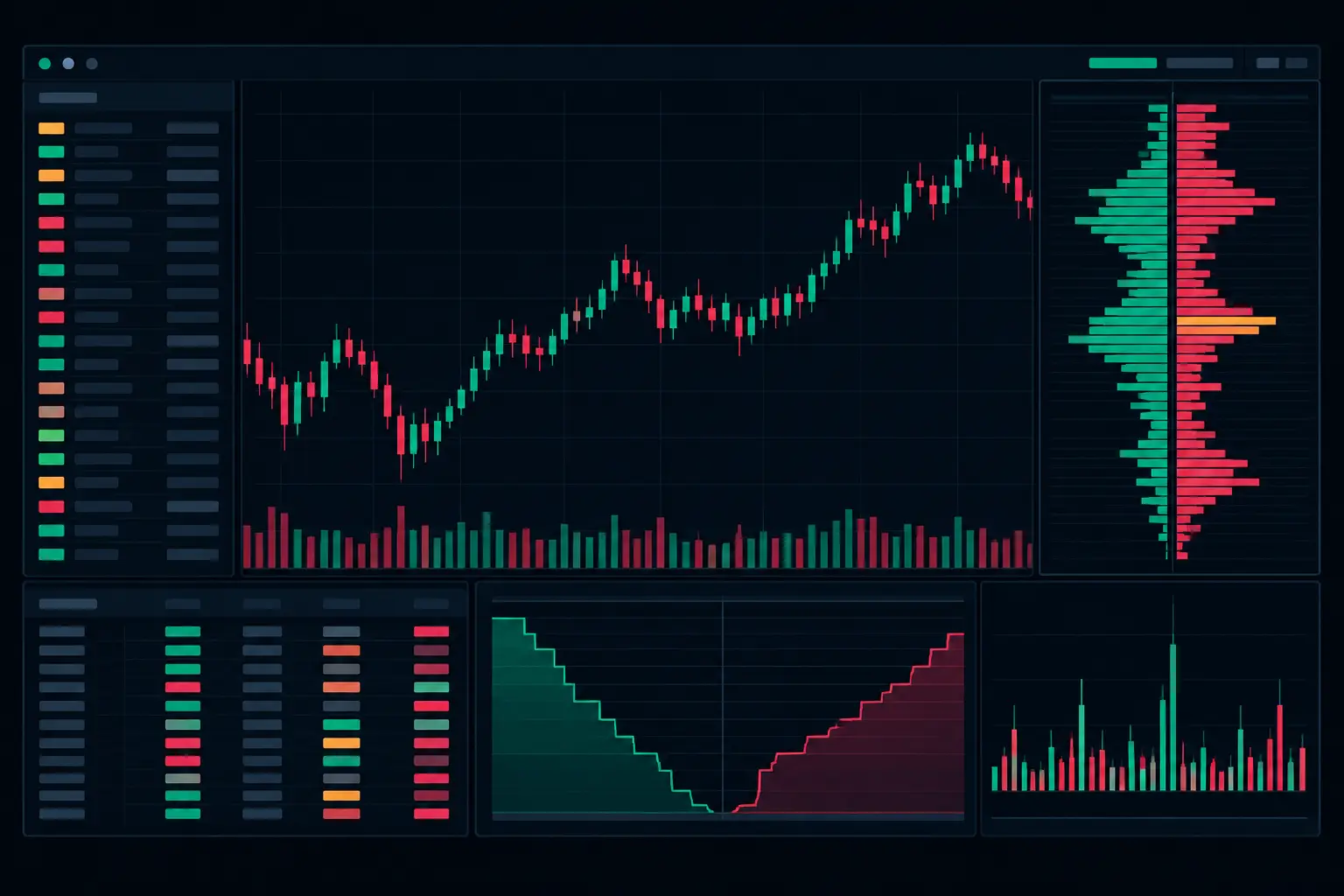
A fast E-mini rotation can print through several price levels before a conventional candle gives you usable context. This futures order flow visualization guide focuses on the chart elements that expose what actually traded at each level: aggressive bid and ask volume, delta, stacked imbalances, passive absorption, VPOC migration, and developing session structure.
Futures Order Flow Visualization Guide: Start With the Price Ladder
Order flow visualization begins with the price ladder, not with a color scheme. A footprint bar separates executed volume at the bid from executed volume at the ask for every price level within the bar. That distinction matters because total volume alone cannot show whether market participants were lifting offers, hitting bids, or meeting resting liquidity without meaningful price extension.
On an E-mini S&P 500 futures chart, a bid x ask layout is the most direct starting point. Bid volume appears on the left side of each price row and ask volume on the right. The bar then becomes a compact auction record: where the market accepted volume, where initiative activity accelerated, and where aggressive execution encountered a passive response.
The first requirement is readable scale. If the chart compresses too many price levels into each bar, the numbers become decoration. If it uses too few, the auction loses detail. Select a bar type that matches the tempo being studied, then keep row height, font size, and bar width large enough to inspect without zooming during a developing bar.
Build a Hierarchy Instead of Coloring Everything
The most common footprint layout failure is visual overload. Every metric may be technically available, but a chart where every cell has a different highlight forces the eye to work harder precisely when the tape is moving quickly.
Assign visual priority to events with different meanings. Neutral bid and ask values should remain quiet. Moderate volume can use restrained shading. Exceptional volume, diagonal imbalances, stacked imbalances, absorption, and exhaustion should have distinct colors that do not compete with each other. The purpose is not to make activity look dramatic. It is to make the exceptional auction condition immediately separable from normal participation.
A practical hierarchy has three layers. First, the footprint numbers show execution at each price. Second, imbalance and delta conditions identify directional aggression within the bar. Third, profile references such as VPOC, value area, and session volume provide location. When these layers are visible at once, the chart answers a more useful question than whether price moved: where did the movement occur relative to accepted and defended volume?
SidiFootprint supports this approach with independent footprint, profile, and event-display controls, allowing the price ladder to remain legible while session context occupies its own visual space. That separation is especially useful when a developing bar is printing rapidly and profile information must remain stable at the edge of the chart.
Configure Bid-Ask and Diagonal Imbalances Correctly
Imbalance visualization is only as good as the comparison rule behind it. A horizontal imbalance compares bid and ask activity at the same price. A diagonal imbalance compares ask volume at one price with bid volume one tick below, or bid volume with ask volume one tick above. The diagonal method follows the natural progression of aggressive execution through adjacent price levels.
For example, ask volume of 480 at 5,250.25 compared with bid volume of 80 at 5,250.00 represents a six-to-one diagonal ask imbalance. That shows aggressive lifting at the higher level relative to selling into the level below. The ratio threshold and minimum-volume filter determine whether that event deserves a highlight.
A low ratio threshold with no volume floor produces too many marks during ordinary two-way trade. A very high threshold may hide relevant activity in quieter periods. Use both controls together. The ratio defines relative dominance, while the minimum volume ensures the comparison has enough participation to matter visually.
Stacked imbalances add location and persistence. Several consecutive diagonal imbalances in one direction create a vertical sequence of initiative execution. Display the stack count clearly, but do not let a single-color block conceal the underlying numbers. The stack is context; the executed volume remains the evidence.
Read Delta as Participation, Not a Standalone Verdict
Bar delta is ask volume minus bid volume. Positive delta means more volume executed at the ask within the selected bar; negative delta means more volume executed at the bid. Cumulative delta extends that running difference across a session or a defined calculation period.
The useful information comes from delta's relationship to price location and bar development. Positive delta at a session extreme that cannot extend may show aggressive buyers meeting passive offers. Negative delta at a low that holds may show aggressive sellers being absorbed by resting bids. Neither condition is meaningful in isolation. The footprint must show where the volume printed, whether the bar extended, and how the auction behaved after the interaction.
Display bar delta where it can be read without obscuring the ladder, typically in the bar summary or a dedicated lower panel. Cumulative delta deserves its own pane when session participation is part of the workflow. Combining both in the same small label usually reduces the value of each.
Delta filters also need restraint. Highlighting every positive or negative bar creates a directional wallpaper effect. Reserve stronger color treatment for statistically large values relative to the instrument's current pace, or for delta occurring at defined session references such as the developing VPOC, value-area boundary, overnight range, or prior session extreme.
Place Volume Profile Where It Adds Auction Context
A footprint chart describes execution within a bar. A volume profile describes where the session has done business. The two views solve different problems and should not be forced into the same display area.
The session VPOC is the price with the greatest traded volume. Its migration can reveal where the auction is building acceptance as new volume accumulates. Value area adds a broader distribution reference around that concentration. A developing profile should update in real time, but its colors and width should remain controlled so it does not cover footprint values.
Use a separate profile column when chart width allows it. This gives the footprint ladder its own space and prevents profile histograms from masking price-level numbers. Dual independent profile columns are useful when comparing a session profile with a secondary reference, such as a composite distribution or a selected range. Keep their alignment exact. A profile displaced by even one tick is worse than no profile at all.
Profile shape also deserves attention. A broad high-volume region and a thin low-volume area are different auction structures. The visualization should make that contrast obvious without implying what must happen next. The chart's task is to show where participation accumulated and where it did not.
Make Absorption and Exhaustion Visible Without Hiding the Tape
Absorption occurs when aggressive volume repeatedly executes into passive liquidity with limited price progress. On the ladder, this may appear as large ask volume near a high with little upward extension, or large bid volume near a low with little downward extension. The defining feature is the mismatch between execution and movement.
Exhaustion is different. It is a reduction in participation at the edge of an auction, often visible as diminishing volume, smaller prints, or a tapered footprint near the bar extreme. The two conditions can appear near the same location, but they should use separate display logic. Absorption emphasizes substantial executed volume and stalled progress. Exhaustion emphasizes a lack of continued participation.
Use event markers sparingly. A marker should point to the relevant price row while preserving the bid x ask values beneath it. For fast markets, configure alerts and text-to-speech only for conditions that are specific enough to deserve attention, such as multiple absorption events at the same price zone or a qualified stacked imbalance at a session reference. Constant notifications train the operator to ignore the chart.
Validate the Layout During a Developing Bar
A footprint workspace should be tested while the bar is developing, not only after the session is complete. Watch whether numbers refresh cleanly, whether imbalance highlights appear at the intended threshold, and whether profile updates interfere with the ladder. This is where rendering speed and layout discipline matter most.
Check the same chart across active and quieter periods. Settings that look precise during a high-volume open can become visually empty midday. Conversely, filters tuned for slow conditions can produce excessive markings when volume expands. It depends on the instrument, the bar construction, and the session segment being examined.
Keep a small set of deliberate presets rather than endlessly changing individual colors and thresholds. One layout can emphasize opening-drive participation, another can prioritize session-profile development, and a third can isolate auction behavior around known references. The footprint calculation remains consistent; the visual priority changes with the analytical task.
A well-built order flow chart does not replace judgment with decoration. It keeps executed volume, aggression, passive response, and auction location visible in the same workspace, so the next developing bar arrives with context already on the screen.
See it on your own chart.
Every Sidi tool is unlocked in the free 14-day demo. Install SidiFootprint in NinjaTrader 8 and load one of the finished color styles to start.
Start free 14-day demo → SidiFootprint features Browse color stylesRelated articles
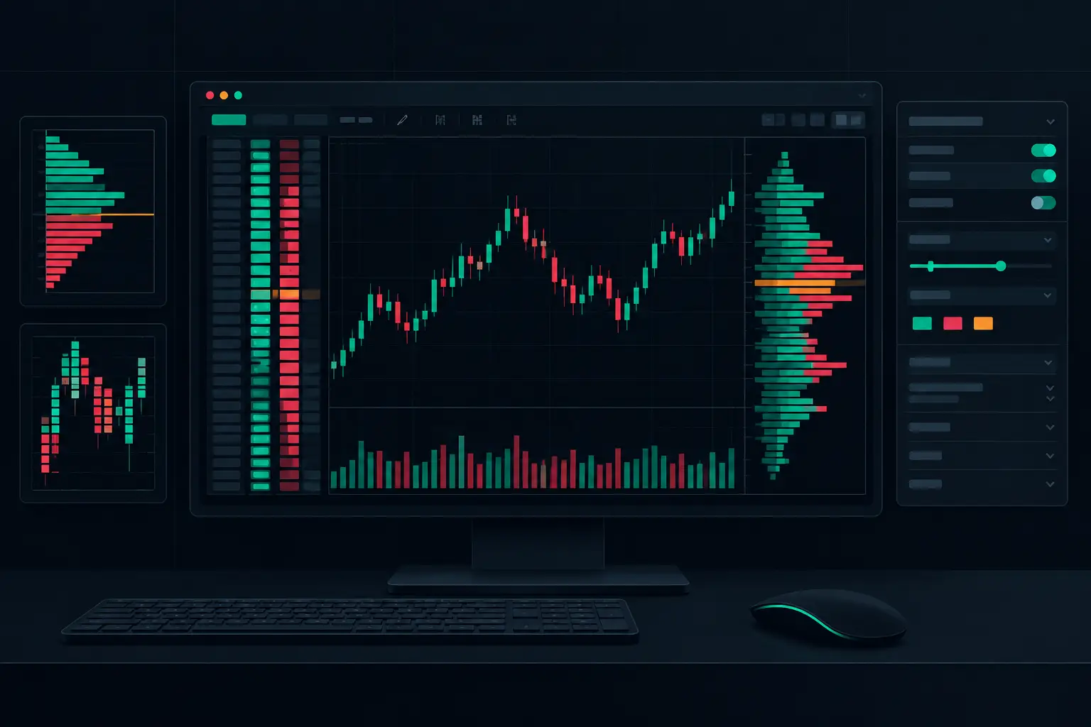
NinjaTrader 8 Order Flow Configuration Setup
Configure NinjaTrader 8 order flow configuration for precise footprint charts, profiles, imbalances, delta, and fast real-time market context on tape.
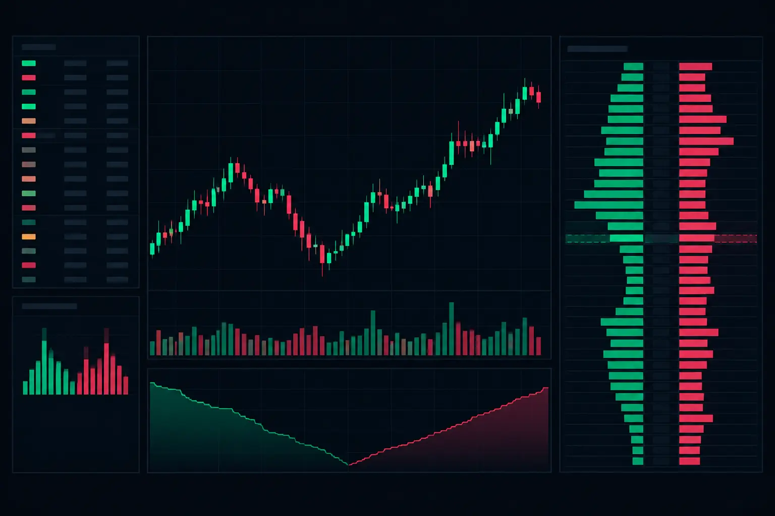
E-mini Bid Ask Visualization That Holds Up
See E-mini bid ask visualization at each price level, with footprint, delta, imbalances, VPOC, and profiles built for fast NinjaTrader 8 charts in motion.

NinjaTrader 8 Footprint Chart for Faster Reads
Build a NinjaTrader 8 footprint chart that exposes delta, imbalances, absorption, VPOC, and auction context when futures order flow accelerates fast.