
Diagonal Imbalance Footprint Chart Explained
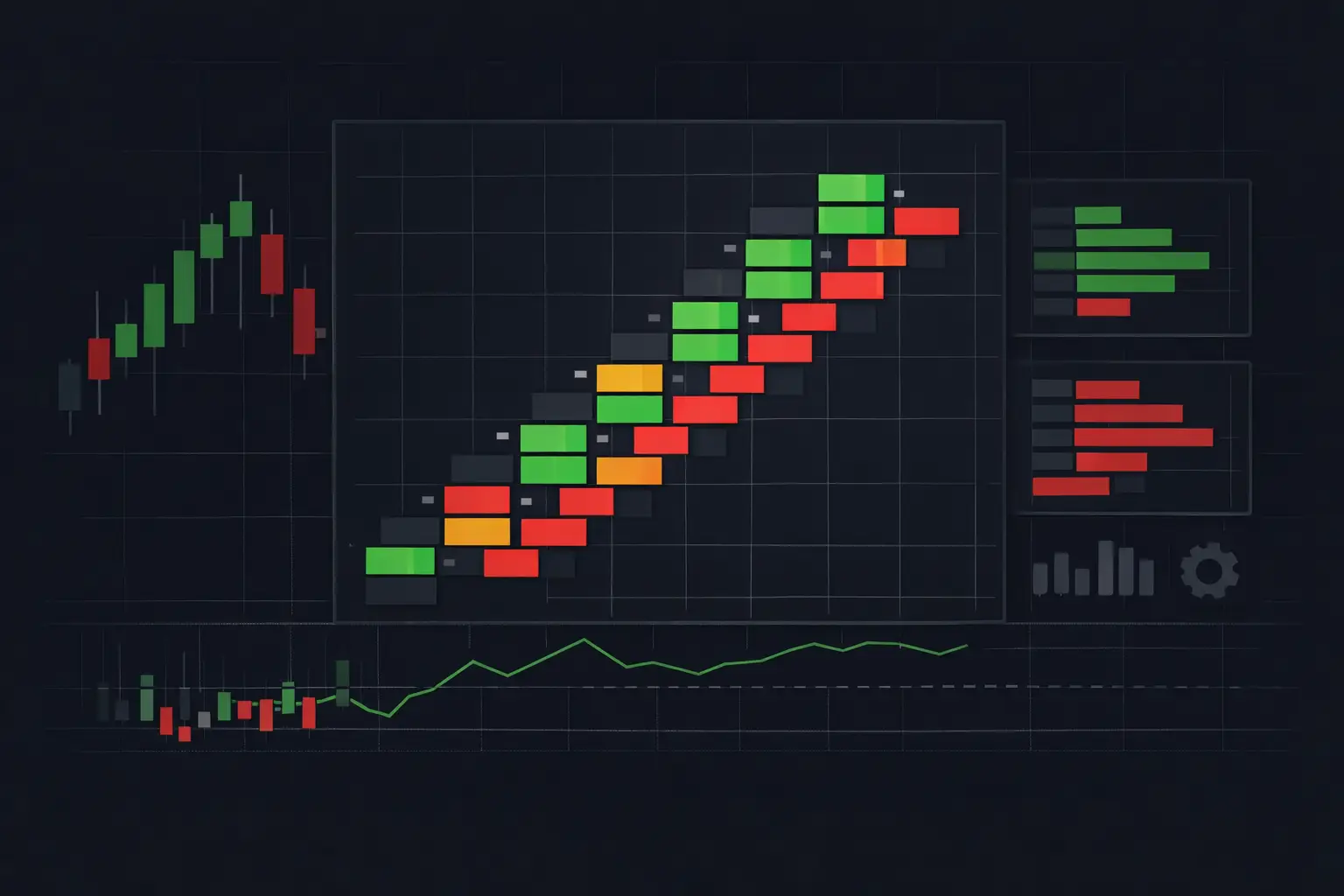
A diagonal imbalance footprint chart is built for the moment when a candle says almost nothing. Price may move only a few ticks, yet the auction at those levels can show aggressive lifting, repeated hitting, absorption, or a one-sided sequence that changes the structure of the developing bar. The footprint exposes what actually traded at each price instead of reducing that activity to an open, high, low, and close.
For active futures traders, the value is not a colored cell by itself. It is the relationship between executed ask volume, executed bid volume, adjacent price levels, and the larger auction context. A diagonal comparison is designed to reveal aggression moving through the ladder. Read correctly, it provides a far more specific view of participation than total bar volume or delta alone.
How a diagonal imbalance footprint chart calculates pressure
A standard bid/ask footprint records volume traded at the bid on one side of each price row and volume traded at the ask on the other. Bid volume represents market participants selling into the resting bid. Ask volume represents participants buying into the resting ask. Both are executed volume. Neither side shows resting liquidity by itself.
Diagonal imbalance logic compares those values across adjacent prices rather than straight across the same row. For a bullish imbalance, ask volume at a price is compared with bid volume one tick below. For a bearish imbalance, bid volume at a price is compared with ask volume one tick above.
The structure matters. Aggressive buying that lifts offers should appear as ask-side activity progressing upward through the price ladder. Aggressive selling that hits bids should appear as bid-side activity progressing downward. A same-row comparison can show an imbalance, but the diagonal method aligns the comparison with how an auction advances from one level to the next.
Consider a one-tick ES ladder segment. If 420 contracts trade at the ask at 5,240.50 and 80 contracts trade at the bid at 5,240.25, the ask-to-bid ratio is 5.25 to 1. With an imbalance threshold set at 4 to 1, the 5,240.50 ask cell qualifies as a bullish diagonal imbalance. The reverse calculation applies on the bid side: bid volume at a level is measured against ask volume one tick higher.
Most footprint configurations also require a minimum volume. That filter prevents a 4-to-1 relationship such as 8 contracts versus 2 contracts from receiving the same visual weight as 400 versus 100. The ratio describes relative dominance. The minimum defines whether the underlying participation is meaningful enough to display.
Ratio settings determine what the chart calls exceptional
There is no universally correct imbalance ratio. A 3-to-1 setting will reveal more events and is often appropriate where the instrument trades with broad participation and fast rotation. A 4-to-1 or 5-to-1 threshold is more selective. It removes noise, but it can also hide early pressure when activity is still building.
The proper setting depends on the instrument, the session, and the chart's aggregation. A 1-tick footprint bar on the E-mini S&P 500 futures contract produces a very different distribution of bid/ask values than a 10-tick bar or a 2,000-volume bar. If aggregation is larger, individual price rows often contain more volume and imbalance sequences may become more visible. The trade-off is reduced detail inside the bar.
Minimum volume should be adjusted alongside the ratio, not treated as an afterthought. Raising only the ratio can still allow low-volume comparisons to appear. Raising only the minimum can suppress useful activity during quieter periods. The goal is a display where highlighted cells stand out because their size and relative imbalance both matter.
Session conditions also change the interpretation. A threshold that creates clean stacked sequences during the regular US session may be overly restrictive overnight. Conversely, a setting that is active overnight may cover a high-volume session with too many highlighted cells. Configurations should reflect the auction being observed, not a fixed visual preference.
Zero prints need separate treatment
A zero print occurs when one side of the diagonal comparison has no executed volume. For example, ask volume may trade at a price while the corresponding bid volume one tick below is zero. This can represent a complete absence of opposing market-order execution in that comparison.
Zero prints are visually powerful, but they require context. At the extreme high or low of a bar, there may be no adjacent row available for a normal diagonal comparison. Some platforms handle these edge rows with special logic, while others exclude them. Confirm how the footprint calculates top and bottom rows before treating a highlighted extreme as equivalent to an internal imbalance.
A zero at an internal price can be useful as an auction detail, especially when it appears within a larger sequence. Isolated zeros in thin conditions deserve less weight than repeated, high-volume diagonal relationships through a developed range.
Stacked imbalances show continuity, not just a single event
One diagonal imbalance identifies a price-level comparison. A stacked imbalance identifies multiple qualifying comparisons at consecutive prices. This is where the chart moves from an isolated statistic toward a readable auction structure.
A bullish stack might show ask imbalances at four consecutive prices as the market trades upward. A bearish stack might show bid imbalances descending through several levels. The count of consecutive levels is configurable and should match the instrument's normal ladder behavior. Requiring two levels creates frequent stacks. Requiring three, four, or more makes the display more selective.
The key detail is continuity. A stack shows that aggression did not occur at one price and disappear. It continued through adjacent levels. Yet a stack is not self-explanatory. It can occur as price drives through an area, as an auction tests beyond a prior boundary, or as participation accelerates into opposing passive liquidity.
That last case is why footprint analysis cannot be reduced to colored imbalances. Heavy ask-side stacks near a prior high may continue higher, but they may also meet sustained resting offers. If price stops advancing while ask volume continues to print, the developing bar can expose absorption. The imbalance describes aggressive activity. The price response and volume profile explain whether that activity is being accepted, rejected, or absorbed.
Read diagonal imbalances beside VPOC and delta
A footprint cell is local. VPOC, value area, session profile, and cumulative delta supply the broader map. Without that map, the same imbalance pattern can mean very different things.
When stacked buying imbalances develop away from a session VPOC and price holds above the developing value area, the chart is showing one form of auction migration. When those same imbalances print directly into a high-volume node and price repeatedly returns to it, the market may be rotating around established acceptance instead. The distinction comes from location and response, not from the imbalance color.
Bar delta adds another layer. A bar can show positive delta while closing lower if aggressive buying met larger passive selling. It can show negative delta while holding near its high if aggressive selling was absorbed. Diagonal cells identify where the aggression occurred. Delta summarizes the bar. Neither replaces the other.
Dual independent profile columns are especially useful here. One column can display a session-based volume profile while another tracks a custom range or developing bar profile. That lets the trader compare local imbalance activity against both the immediate structure and the larger auction distribution without switching studies or sacrificing chart space.
Configure the display for fast decisions, not visual noise
Color hierarchy should separate ordinary bid/ask cells from qualified imbalances, stacked imbalances, zero prints, and maximum-volume cells. If every condition uses saturated color, the ladder becomes harder to read when the tape accelerates. Reserve the strongest contrast for the condition that requires the fastest recognition.
Text size, row height, column order, and profile placement are operational settings. A dense chart may suit a trader monitoring several instruments, while a wider footprint can be necessary for precise ladder reading on a single primary market. The right layout is the one that preserves legibility without forcing the eye to search for the active comparison.
SidiFootprint supports separate controls for imbalance ratios, minimum volumes, stacked counts, visual states, profiles, and developing-bar information, allowing the chart to reflect the exact structure being monitored. The useful configuration is not the one with the most highlights. It is the one where a highlighted event immediately communicates its calculation and its place in the auction.
A practical review sequence
Before using diagonal information during an active session, verify four items: the bid/ask data is populating correctly, the tick size matches the instrument, the imbalance ratio and minimum volume produce selective highlights, and stacked conditions are visually distinct from isolated cells. Then inspect several completed bars across different conditions. A setting that looks clean during slow rotation may behave very differently during a fast directional auction.
Keep the chart anchored to observable facts. A diagonal imbalance footprint chart shows executed aggression at a specific price relative to an adjacent level. VPOC shows where volume concentrated. Delta shows the bid/ask difference. Absorption appears when execution and price response diverge. When those components are visible together, the developing auction becomes easier to read without asking a candle to reveal information it never contained.
See it on your own chart.
Every Sidi tool is unlocked in the free 14-day demo. Install SidiFootprint in NinjaTrader 8 and load one of the finished color styles to start.
Start free 14-day demo → SidiFootprint features Browse color stylesRelated articles
Horizontal Versus Diagonal Imbalance Detection
Horizontal versus diagonal imbalance detection clarifies bid/ask aggression at each price, giving futures traders clear footprint context in fast auction.
NinjaTrader Indicators for Order Flow Control
NinjaTrader indicators turn bid/ask activity into real-time chart context. Configure footprint, profile, delta, and alerts for active futures markets.
Futures Auction Analytics at Each Price Level
Futures auction analytics reveals the bid/ask interaction, delta, volume, and acceptance behind every developing futures auction in real time as it forms.